
Photo by David Dvořáček on Unsplash
Data visualization is one of the most critical aspects of data analysis. Python offers a wide range of powerful libraries for creating informative, attractive, and interactive visualizations. Among these, Matplotlib, Seaborn, and Plotly are the most commonly used libraries. Each of these libraries has its strengths and is suited to different types of data visualization tasks. In this blog, we will explore and compare Matplotlib, Seaborn, and Plotly to help you decide which one is the best fit for your project.
Table of Contents
Introduction to Python Visualization Libraries
Matplotlib: The Foundation of Visualization in Python
2.1. Basic Plotting with Matplotlib
2.2. Advantages of Matplotlib
2.3. Limitations of Matplotlib
Seaborn: Built on Top of Matplotlib
3.1. What is Seaborn?
3.2. Advantages of Seaborn
3.3. Limitations of Seaborn
Plotly: Interactive and Web-Ready Visualizations
4.1. What is Plotly?
4.2. Advantages of Plotly
4.3. Limitations of Plotly
Comparison of Matplotlib, Seaborn, and Plotly
5.1. Ease of Use
5.2. Customization
5.3. Interactivity
5.4. Output Formats
Conclusion
1. Introduction to Python Visualization Libraries
Data visualization is a vital step in the data analysis process. It helps in understanding complex data patterns, identifying trends, and communicating findings effectively. Python provides several libraries for data visualization, each with its strengths and weaknesses. Among the most popular visualization libraries in Python are Matplotlib, Seaborn, and Plotly. These libraries are commonly used by data scientists and analysts for creating static, animated, and interactive visualizations.
2. Matplotlib: The Foundation of Visualization in Python
2.1. Basic Plotting with Matplotlib
Matplotlib is the most widely used and fundamental library for data visualization in Python. It provides a simple interface for creating static, animated, and interactive plots. Matplotlib allows you to create a wide range of visualizations, from basic line charts to complex 3D plots.
Example of a simple line plot with Matplotlib:import matplotlib.pyplot as plt
# Data
x = [1, 2, 3, 4, 5]
y = [1, 4, 9, 16, 25]
# Plot
plt.plot(x, y)
plt.title('Basic Line Plot')
plt.xlabel('X-axis')
plt.ylabel('Y-axis')
plt.show()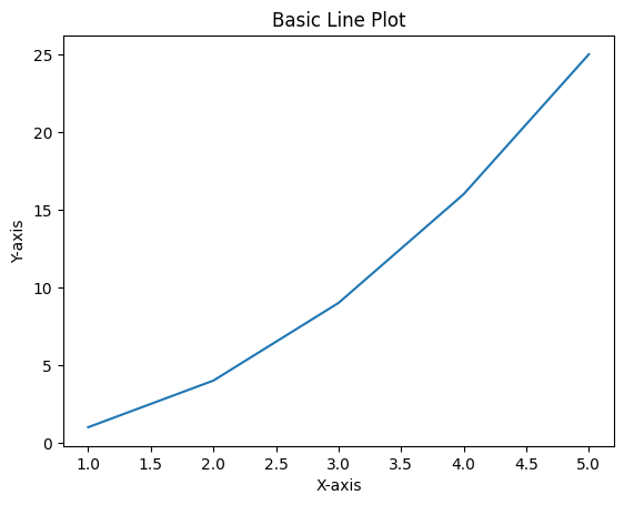
Matplotlib is highly customizable, allowing you to fine-tune almost every element of the plot (axes, labels, legends, etc.).
2.2. Advantages of Matplotlib
Versatility: Matplotlib is capable of creating a wide variety of plots, including line plots, bar charts, histograms, scatter plots, heatmaps, and more.
Customizability: It provides fine control over the aesthetics of the plot (fonts, colors, layout, etc.).
Extensive Documentation: Matplotlib has excellent documentation and a large community, which makes it easy to learn and troubleshoot.
Integration with Other Libraries: It works well with other Python libraries like NumPy, Pandas, and SciPy.
2.3. Limitations of Matplotlib
Complex Syntax: While Matplotlib is powerful, its syntax can be verbose and complex, especially when compared to libraries like Seaborn.
Default Styling: The default visual appearance of Matplotlib plots is often considered plain and not suitable for high-quality publication.
3. Seaborn: Built on Top of Matplotlib
3.1. What is Seaborn?
Seaborn is a high-level Python data visualization library based on Matplotlib. It provides a more user-friendly interface and integrates with Pandas data structures, making it easier to visualize statistical data. Seaborn offers enhanced default styling, better integration with categorical data, and more complex plots with simpler code.
Example of a Seaborn plot:import seaborn as sns
# Load example dataset
tips = sns.load_dataset('tips')
# Create a boxplot
sns.boxplot(x="day", y="total_bill", data=tips)
plt.title('Boxplot of Total Bill by Day')
plt.show()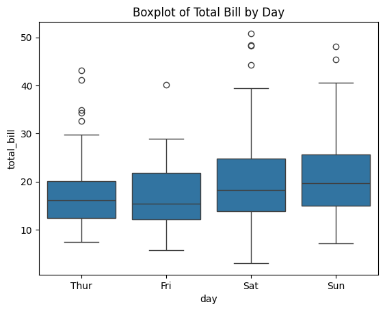
Seaborn automatically handles many aspects of plotting, such as axis labels, legends, and color schemes.
3.2. Advantages of Seaborn
Better Aesthetics: Seaborn comes with better default styling and color palettes, making it ideal for creating attractive visualizations without much effort.
Integration with Pandas: Seaborn integrates seamlessly with Pandas DataFrames, allowing you to visualize data directly from a DataFrame without needing to manually extract values.
Statistical Plots: Seaborn makes it easy to create statistical plots like box plots, violin plots, pair plots, and heatmaps with minimal code.
Ease of Use: Seaborn’s syntax is simpler and more concise than Matplotlib’s, making it a great choice for quick visualizations.
3.3. Limitations of Seaborn
Less Customizable than Matplotlib: While Seaborn simplifies many tasks, it is not as flexible as Matplotlib for highly customized plots.
Limited Plot Types: Seaborn does not have as wide a variety of plot types as Matplotlib, and it lacks 3D plotting capabilities.
4. Plotly: Interactive and Web-Ready Visualizations
4.1. What is Plotly?
Plotly is a graphing library that allows you to create interactive and web-based visualizations. It is widely used for creating dashboards and interactive plots that can be embedded into web applications. Plotly supports a wide range of plot types, including 3D plots, geographic maps, and statistical charts.
Example of an interactive Plotly plot:import plotly.express as px
# Load example dataset
tips = px.data.tips()
# Create a scatter plot
fig = px.scatter(tips, x="total_bill", y="tip", color="sex", title="Scatter Plot of Tips vs Total Bill")
fig.show()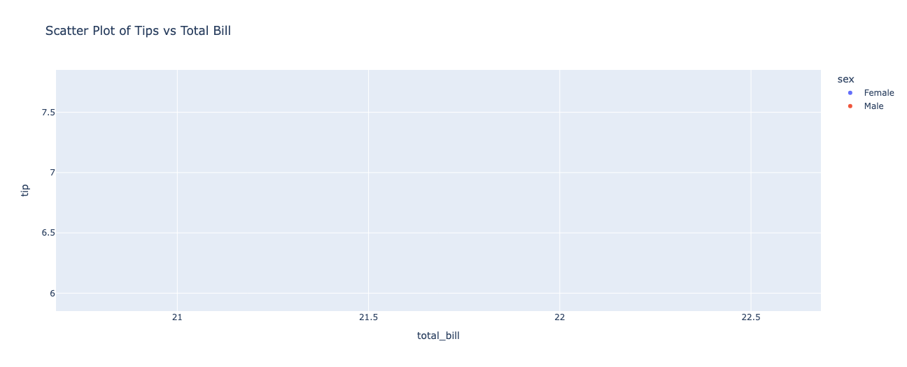
Plotly visualizations are interactive by default, allowing users to zoom, pan, and hover over elements for more information.
4.2. Advantages of Plotly
Interactivity: Plotly’s interactive features allow users to zoom in, hover over data points for details, and explore the visualization in greater depth.
Web-Ready: Plotly visualizations can be embedded in websites or web applications, making it ideal for building interactive dashboards.
Wide Range of Plot Types: Plotly supports a wide variety of charts, including 3D plots, maps, and complex statistical charts.
Easy Integration with Dash: Plotly integrates seamlessly with Dash, a framework for building interactive web applications using Python.
4.3. Limitations of Plotly
Learning Curve: Plotly’s syntax can be more complex than Matplotlib or Seaborn, especially for more advanced visualizations.
Performance: While Plotly excels at interactive plots, it can be less performant for handling very large datasets compared to static libraries like Matplotlib.
Limited Customization: Plotly provides interactive features but may not be as customizable as Matplotlib for fine-tuning every aspect of a plot.
5. Comparison of Matplotlib, Seaborn, and Plotly
5.1. Ease of Use
Matplotlib: Powerful but has a steeper learning curve due to its verbose syntax.
Seaborn: Easier to use than Matplotlib with simpler syntax and better defaults for statistical plots.
Plotly: Very easy to create interactive visualizations, but its syntax is more complex for advanced customizations.
5.2. Customization
Matplotlib: Highly customizable, suitable for creating intricate and highly tailored plots.
Seaborn: Offers good customization, but is not as flexible as Matplotlib for advanced adjustments.
Plotly: Limited customization for static elements, but excellent interactivity and customization for web-based plots.
5.3. Interactivity
Matplotlib: Static plots with no interactive features.
Seaborn: Primarily static plots, but can be used in conjunction with Matplotlib to add interactive features.
Plotly: Fully interactive plots with zooming, panning, and hover capabilities.
5.4. Output Formats
Matplotlib: Supports saving plots in various formats such as PNG, PDF, SVG, etc.
Seaborn: Built on top of Matplotlib, so it supports similar output formats.
Plotly: Supports interactive web-based visualizations that can be embedded in websites or saved as HTML files.
6. Conclusion
Each of the Python visualization libraries—Matplotlib, Seaborn, and Plotly—has its strengths and is suited for different types of data visualization tasks.
Matplotlib is the go-to library for basic plotting and highly customizable visualizations, making it suitable for static plots and academic research.
Seaborn is ideal for quick, aesthetically pleasing statistical plots, particularly when working with Pandas DataFrames.
Plotly shines in creating interactive, web-ready visualizations and dashboards, making it perfect for web applications or when you need to provide an interactive experience.
Choosing the right library depends on the project requirements, such as whether you need static or interactive plots, the complexity of customization, and the type of data you're working with.
Happy plotting!